

Tailwind CSS is a low-level CSS framework that’s highly customizable. Unlike other frameworks or UI kits that provide pre-designed components (buttons, cards, modals, etc.) to help you get started quickly but can be cumbersome to customize later, Tailwind focuses on low-level utility classes (utility-first), allowing you to build your own design without worrying about overriding existing styles.
In this post, I’ll guide you on how to integrate Tailwind CSS into a React app 
Create a React App
The simplest way to create a React app is by using the create-react-app script with npx
npx create-react-app my-app && cd my-app
Using npx lets you run the create-react-app script without needing to install the package.
Adding dependencies
Install the following devDependencies to set up Tailwind CSS
yarn add tailwindcss postcss-cli autoprefixer -D
## or npm install tailwindcss postcss-cli autoprefixer --save-dev
Besides Tailwind CSS, we’ll also install:
- PostCSS: A tool for analyzing and transforming styling using JS plugins, which helps with CSS suggestions, supporting variables and mixins, compiling new CSS features, etc.
- Autoprefixer: A PostCSS plugin that automatically adds vendor prefix (
-webkit-,-moz-,-ms-,-o-, etc.) based on data from Can I Use to ensure your CSS works on multiple browsers.
Configuring PostCSS
PostCSS helps manage and configure your CSS build process.
Create a config file:
Add the following config:
module.exports = {
plugins: [require('tailwindcss'), require('autoprefixer')],
}
This build process uses two plugins: tailwindcss and autoprefixer.
Injecting Tailwind CSS
Create a sub-folder named styles inside the src folder. In the styles folder, create a file called tailwind.css.
Or use the command line:
mkdir src/styles && touch src/styles/tailwind.css
Import the following modules from Tailwind CSS:
@tailwind base;
@tailwind components;
@tailwind utilities;
You can place the tailwind.css file in any folder you like, such as src/static, src/assets, src/styles …
Adding build script
Open the package.json file and add the following build script (inside the scripts object):
"build:css": "postcss src/styles/tailwind.css -o src/styles/main.css"
This script uses PostCSS CLI to build the CSS based on the config in the tailwind.css file, with the output (flag -o) as main.css.
You can choose the file name and location as you like. Here, I’m putting both the input config file and output in the same folder: src/styles.
Now you can manually trigger the build with the command:
yarn build:css
# or npm run build:css
After configuring and building, your project structure should look like this:
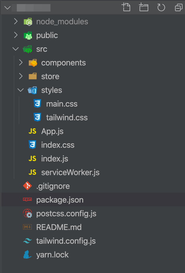
To make things easier, you can integrate the build:css command into the start and build scripts of your project, ensuring that your CSS is always rebuilt with the latest updates each time you start the project:
"scripts": {
"start": "npm run build:css && react-scripts start",
"build": "npm run build:css && react-scripts build",
"test": "react-scripts test",
"eject": "react-scripts eject",
"build:css": "postcss src/styles/tailwind.css -o src/styles/main.css"
}
// more configs...
Now to build the CSS and start the project, you just need to run yarn start.
Using Tailwind CSS in a React component
Import the built CSS into the start file of your project (mine is index.js):
import './styles/main.css'
Create a basic component:
import React from 'react'
function App() {
return (
<div className="flex justify-center pt-8">
<div className="w-full max-w-sm shadow-lg lg:flex lg:max-w-full">
<div
className="h-48 flex-none overflow-hidden rounded-t bg-cover text-center lg:h-auto lg:w-48 lg:rounded-l lg:rounded-t-none"
style={{
backgroundImage: `url('https://image-us.24h.com.vn/upload/1-2020/images/2020-02-06/kodfd-1580928361-474-width640height480.jpg')`,
}}
title="Woman holding a mug"
></div>
<div className="flex flex-col justify-between rounded-b border-b border-l border-r border-gray-400 bg-white p-4 leading-normal lg:rounded-b-none lg:rounded-r lg:border-l-0 lg:border-t lg:border-gray-400">
<div className="mb-8">
<p className="flex items-center text-sm text-gray-600">Latest News</p>
<div className="mb-2 text-xl font-bold text-gray-900">
Messi is moving to Manchester City
</div>
<p className="text-base text-gray-700">
Lorem ipsum dolor sit amet, consectetur adipisicing elit. Voluptatibus quia, nulla!
Maiores et perferendis eaque, exercitationem praesentium nihil.
</p>
</div>
<div className="flex items-center">
<img
className="mr-4 h-10 w-10 rounded-full"
src="https://encrypted-tbn0.gstatic.com/images?q=tbn%3AANd9GcRG2WOlZ4KLuNN1ksjNOmh6oZ091IUhJiZD7w&usqp=CAU"
alt="Avatar of Jonathan Reinink"
/>
<div className="text-sm">
<p className="leading-none text-gray-900">Jonathan Reinink</p>
<p className="text-gray-600">Aug 18</p>
</div>
</div>
</div>
</div>
</div>
)
}
export default App
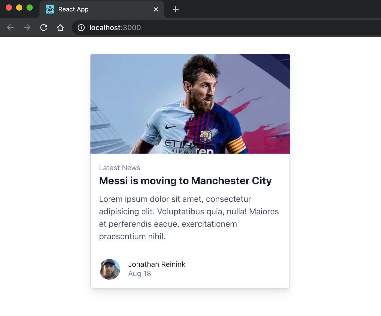
Here’s the result 
Conclusion
I hope you can integrate and use Tailwind CSS in your project through this tutorial. Personally, I find this framework quite simple, easy to use, and of good quality.
Leave your comments below if you have any feedback